Cash runwayStable
4 months
Cash position is stable for now. No immediate action needed.
Neura · Independent engagement
I designed Neura’s MVP around cash runway and a short list of actions. The interface explained what the numbers meant and gave people a way to check the reasoning.
4 months
Cash position is stable for now. No immediate action needed.
What needs your attention
Based on what’s coming in and going out, you could dip below $10k around mid-month.
Suggested actionConsider chasing outstanding invoices.
Bank transactions (90 days) · Outstanding invoices · Recurring expenses · Payroll schedule
Also worth knowing
Operating expenses are higher than your 3-month average. Most of this is subcontractor costs (+$2,400).
Review subcontractor invoices before month-end.
4 months
Cash position is stable for now. No immediate action needed.
At the current burn rate, the business has about four months of cash available.
The estimate uses cash available and the monthly burn rate. It depends on the transactions available from Xero.
Medium confidence
A stable runway can still include a short-term cash gap. Review the timing of overdue invoices on the overview.
Neura connected to Xero and calculated financial insights on the server. The founder and backend engineer owned those calculations. I worked on the interface that presented them to business owners who needed a quick understanding of their cash position.
The initial scope was five screens. I kept the overview as the main destination, with one detail template for insights. People could connect Xero and reach the overview before choosing where to go next.
The overview leads with runway in months and a short status. Under that, insights explain what is happening and suggest an action. A business can have several months of runway and still face a cash gap before an invoice gets paid, so those messages needed their own space.
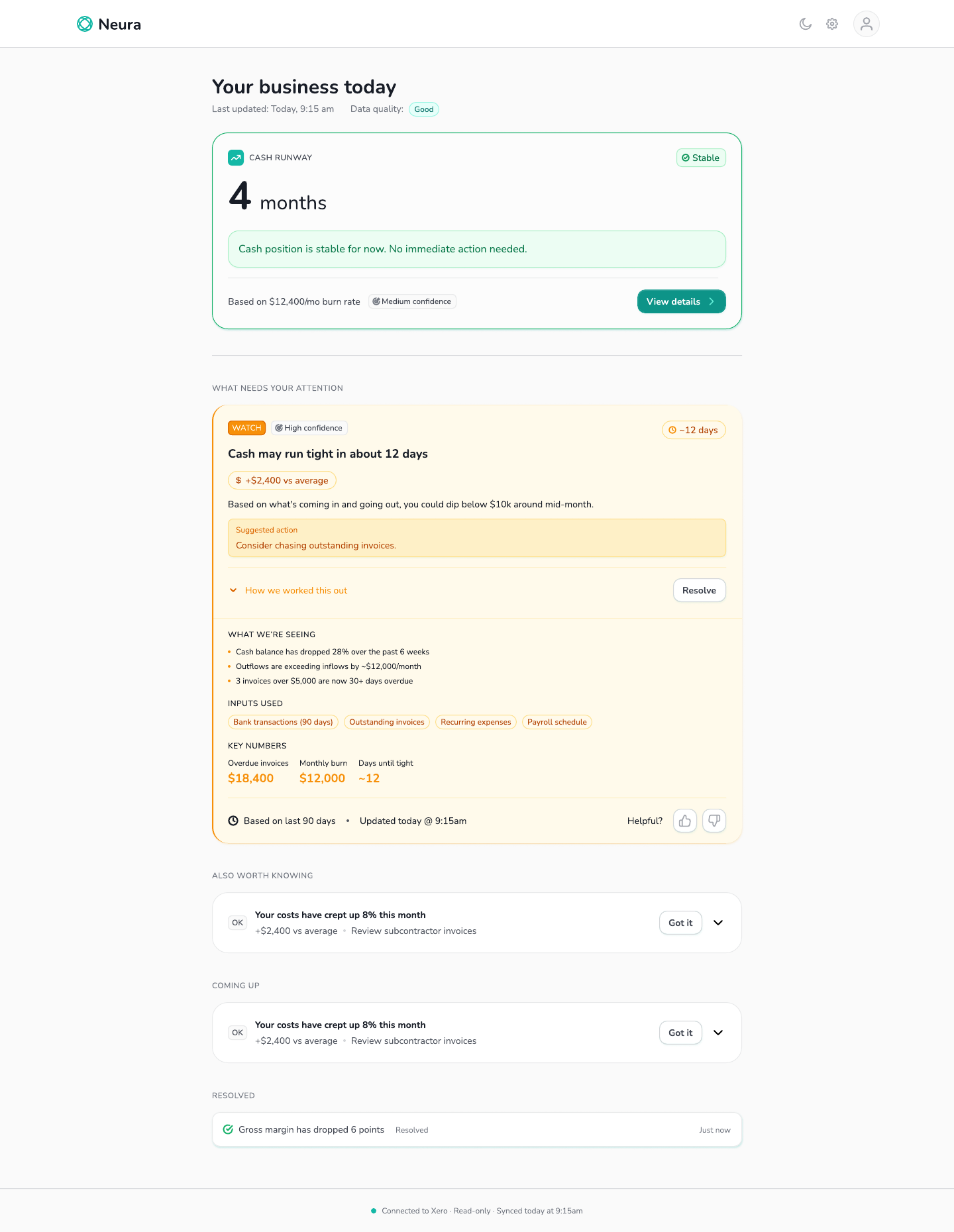
I put “How we worked this out” beside the recommendation. It opens the supporting observations, data inputs and key numbers without taking someone away from the overview.
Confidence and data quality are visible separately. The design uses approximate language for forecasts, including “about 12 days,” so the interface does not imply more certainty than the data supports.
I documented the first connection to Xero, partial data, failed loads and resolved insights. The setup flow shows its progress and offers a notification when the first import takes longer.
The connection copy also explains what Neura can access and that it does not change anything in Xero. Those details help someone understand what they are agreeing to before connecting their account.
The first connection depended on an import finishing. I designed a progress state and a notification option so people could leave that screen and return when their insights were ready.
The delivery included responsive layouts, light and dark states, and interaction notes for the core screens.